Analysis of three Music Artists Websites
https://www.chrisbrownworld.com/home/ - Chris Browns Website
His website starts off with a large picture of his recent single which takes over most of the screen which is quite dark and illuminated. This gives a sense of dark and mystery to the overall page and also promotes his new single. The font at the top of the page is the same for all sections and its a basic white Font. This suggests that he may be a very straight up person and not to complicated.
The whole layout is consistent as the font size, style and colour stay the same which shows its sophisticated and professional which suggests he must be a very big popular star.
Chris brown is represented in a very low key style as his name is only mentioned Twice in the Main page and only in a plain small font. Also there are no pictures of him or autobiography therefore this may suggests he's very down to earth and 'normal' as he tries to break away from the big pop star image. Overall this website shows of Chris browns character very well and promotes his music well.
https://www.dollasignworld.com - TY Dolla $igns website
Ty's Website is much more different to Chris Browns website. Firstly his is more black and white compared to bright illuminated colours, and its a lot more bold and small compared to Breezys page which takes over the whole screen. This could suggests TY is 'straight up' and 'gets to the point' type of person. His layout is quite basic and is not as sophisticated or professional therefore suggests TY may be smaller less popular star to chris brown. He uses a range of fonts which could represent he's messy but they are regularly the same size and colour therefore shows he does have some control. It doesn't contain any photos of him on his website and only says his name once which could also represent he is low key. Overall this website doesn't stand out from other websites as theres no bright colours and no photos which comes across as a bit 'bland', however this may represent TY's low key style therefore a good representation of the artist himself.
https://www.arianagrande.com - Araina Grande
Ariana style is much more different to the artists before as the first page of the website is much more messy and unorganised. Her name is upside down in a big white font which is hard to read which could represent she is hard to understand as a person. Also, her front page consists of a range of photos in a 'grain' typed filter which could be seen as old fashioned and she may do this to come across as mature and older as she actually is a young artist herself. She also has her traditional font which she uses for her titles and Singles which promote her self and music as when we see this font we instantly think of her. She uses a range of colours from black and white to bright pink which perhaps represents she has a nice and sweet side (like when she was in disney) but also has a dark different side which she may be trying to show and bring out. Overall this website consists of a variety of colours and pictures which represents her personality but the lack of consistency and quality shows her age and professionalism.
Subscribe to:
Post Comments (Atom)
Music video production
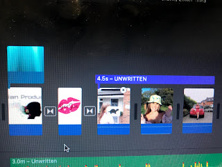
At the start of my video I used slow motion on the third clip and I used an overlap of the title to fade in and fade out after 4.5 seco...
No comments:
Post a Comment